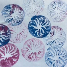
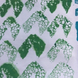
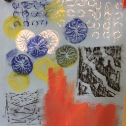
Category Archives: 5 – Painting and printing

Research and reflection – Project 5

18 Nov 2014

This entry addresses the questions at the end of Project 5: Printing and painting.


1) Do you feel you made a good selection from your drawings to use as source material for your designs? Which interpretations worked best? Why?

I am pleased with my selections. The four designs I chose (two from Project 4, stage 4, two new designs) provided scope for experimenting with different printing and painting techniques. I am most pleased with the sunflower interpretation. This was a new design and I applied the techniques which I had learnt earlier in the course  to develop the ideas. I used mono-printing, freehand painting and a lino-cut as a print-block for these designs, which were well balanced and lively.


2) Which fabrics did you choose? What particular qualities appealed to you?

I used faux suede, needlecord, calico, linen, cotton drill, cotton muslin, cotton of various weights, sheer synthetic, loose weave synthetic and vilene. I particularly liked the sheerness of the cotton muslin combined with it’s loose weave – pressing down with a lino-roller on the acetate during mono-printing gave interesting marks from the edges of the roller. I also liked using taffeta when making rubbings using Markal paint-sticks – the fabric which seemed to accentuate their ‘buttery’ texture. 

In each instance, the suitability of fabric depended on the type of mark, the medium with which the marks were made,, and how they were applied (i.e. brushes, rubbing, scraper)


3) Is the scale of marks and shapes on your samples appropriate to the fabric? Would any of your ideas work better on a different type of fabric, for example, sheer, textured, heavyweight? Why? Do the marks and shapes seem well placed, too crowded, or too far apart? Were you aware of negative shapes that were forming in between the positive shapes? What elements are contrasting and what elements are harmonising in each sample? Is there a balance between the two that produces an interesting tension?

I feel that I chose fabric pieces which were appropriate to the scale of the marks. I tried a wide variety of fabrics, so I am content that I have explored the suitability of most fabric types for the different methods of printing and mark-making. For example, the ‘tiger stripes’ worked well on the faux suede fabric with mono-prints and direct marks using Markal paint-sticks. This fabric gave poor results when Markal rubbings were made on it using the ‘lichen’ design and cardboard raised shape/stencil. 

In general I was pleased with the spacing of the shapes. In the ‘lichen’ design, I tried both spacing the stencils and overlapping them. Both worked and gave different dimensions to the print,  and different negative shapes. When I used freezer paper as a stencil and decorated the background with fabric paints the plain masked off images were very bold and of high contrast. I felt this was too much.  I ‘calmed’  subsequent prints by patterning the background before masking,  or applying additional prints/patterning after removing the masking paper.  This gave a balance between contrast and harmony of  colour and pattern.


4) How successful do you think your larger sample is? Do you like the design? Have you recreated or extended your ideas from the smaller samples so that there is a visible development between the two? Does your repeating design flow across the surface without obvious internal edges? or do the shapes and marks in your single unit sample related well to the size and shape of the fabric? Do they make an interesting composition on this scale.

I made two larger samples. I was quite pleased with the ”single unit’  print, although I  think it may have been better as a series of printed rectangles with different colours and textures, rather than having been made in the style of a painting.  I did a lot of samples with different techniques and fabrics  before starting the final piece, so I am satisfied that I explored different possibilities  and that progression can be seen between design ideas and final piece.  

I would say that my repeating design does flow across the surface without obvious internal edges, because the repeat for different aspects of the print (i.e. rose design, trellis, leaves) are all different. I think that the rose design (rubbings) part of the print is still too solid and that there needs to be more movement in the design. Maybe a way to do this would be to replace the lino-cut rubbings with a softer, less bold rose image. I think that the scale of the pattern is good and that the size of the pattern repeat would work well on soft furnishings.

Project 5, Stage 4 – A larger sample

18 Nov 2014

I took the opportunity to creating two ‘larger samples’. As suggested in the course notes, the first was a ‘single unit’ piece, the second a ‘repeating pattern’.

Single unit’ piece

For the ‘single unit’ piece, I chose the theme of Aston Park fisheries in Sheffield. I had spent the day there and made several sketches and painted analogies. 

After I got back home, I concentrated on textured areas of the landscape, the form of the trees against the sky and ripples and reflections in the water. I undertook a series of studies to see how these ideas might be developed with marks.

Top left: Undercoat of acrylic left to dry. second coat painted over in a different colour then ‘pulled through’ with a comb. This is an analogy of a ploughed field with winter wheat coming through. 

Top right: White acrylic thickly painted on a white background, ‘pulled through’ with a comb, left to dry, then ‘scumbled’ using Sennelier oil pastels

Bottom left: As above, but white acrylic applied with a sponge.

Bottom right: Analogies of trees and foliage using the edge of a credit card, toothbrush and small piece of sponge to apply acrylic paint.

Middle: Two trees. Both have black acrylic as undercoat. Middle left is an over-coat of white oil pastel, middle right is overpainted with white acrylic. The tree is made by scraping back with a cocktail stick in both cases.

After completing these textural studies on paper, I made a series of small test pieces on fabric.

Above top: Mono-print using acetate with black fabric paint on cotton muslin. The design was drawn using a cocktail stick. A lino roller was used to press down on the fabric, which gave an attractive, subtle striping to the background. 

Below left: I made a block print by gluing u-shaped pieces of wire onto cardboard. The printing was using black fabric paint on white cotton muslin.

Below right: A mono-print, as above top, but on black linen, using white fabric paint.

For the water, I tried two different approaches. First, making rubbings with Markal paint-sticks using a lino-cut (picture below right – top left and bottom right-hand corners), secondly using bond-a-web painted with acrylic paints (picture below left).


Once I had selected the elements that I wished to use, I started preparing my final piece. Firstly, I used a brush to lay down a rough outline of the sections of colour using fabric paints (below left). I then painted on the ploughed field and made furrows by ‘pulling through’ with a comb. I block-printed the trees, and emphasised detail using marks made with the edge of a credit card (below right).

I applied previously painted bond-a-web as an analogy for water (below left). I ‘softened’ the edges of the bond-a-web by applying fabric with a brush, and printed the reflections of the trees and shrubs (below right).

To complete the printing (below), I added more printed tree branches, used a roller to apply gold and green paint, giving greater texture to the banks. I used the edge of a credit card to paint in the reeds and bullrushes, and the end of a dowel to print the autumn colours on the tree to the far right. 


The finished piece, although made entirely using fabric paints resembles a painting rather than a print. Despite this, it uses lots of different fabric printing techniques and shows the versatility of these marks. I am pleased with the feeling of depth that I have created. I think it might have been better if I had applied less fabric paint to the bond-a-web sections and been satisfied for these to have been left more disjointed. It would be interesting to make an additional study in which each of the areas of differnt printing are distinct rectangle (maybe multiple).


‘Repeating pattern’ piece

I took the idea of ‘roasted onions’ pattern from Project 4, stage 4 (developing design ideas). I started by making rubbings on paper with wax crayons using a lino-cut of the onion shape. I also rubbed marks using lego. I cut out the shapes and arranged then on coloured backgrounds. I tried variations with black marks on white paper, white marks on red paper and red marks on white paper.

In the arrangement above I liked the broken diagonal stripes made by the lego rubbings. I felt, however that the pattern was very regimented and lacked ‘movement’, so I broke up the design by putting a stencilled spider between the squares (below)

This intervention immediately draws the eye away from the blocks and makes the print more dynamic. As the ‘onion halves’ resembled roses, I thought about swapping the spider for rose leaves (below)!


I then used the lino-cut to experiment with Markal paint-sticks. I tried rubbings on taffeta, calico, linen and pure silk. I also used lego and a square ‘trellis-like’ plastic block to make rubbings. It was at this stage that I had the idea of slightly offsetting two lino rubbings.   

In the final piece, I used a grid layout and offset the half-rose flower shapes (below). I used a dark green taffeta as the base fabric, used gold Markal paint-sticks to make rubbings of the trellis, and stencils for the leaves which were painted with green fabric paint.

Although I like elements of the design, I can’t imagine wanting to use this fabric as a pair of curtains or cushions. The roses still feel very ‘solid’ as an overall design. Despite drawing gridlines with tailors’ chalk it was difficult to get the rose and trellis rubbings even (maybe this adds to the charm?!). I think that the rubbings have come out very well, especially where iridescent pink and red Markal paint-sticks have been used together and blended.


Project 5, Stage 1-3 Printing and painting on fabric

17 Nov 2014

Stage 1 – Reviewing your fabric collection

I chose a variety of fabrics from my collection to practice printing, including different weights, sheerness and composition. The list included: faux suede, cotton needlecord, sheer nylon, synthetics (including nylon, taffeta), cotton drill, cotton poplin, cotton muslin and linen.

Stage 2 – Selecting your designs

For my first design I chose the ‘tiger stripes’ pattern from Project 4, Stage 4. I liked the texture of the fur and colours from this design.


I also chose a ‘lichen’ pattern which I had developed from the ‘flint wall’ idea, again from Project 4, Stage 4. I selected this pattern because of the potential for masking and stencilling and exploring the positive and negative image.

lichen_stars.JPG

My third choice was a series of designs based on sunflower photos taken on holiday. It included a lino cut of a reflected image of the petals, and exploration of textures from the centre of the flower and petals.

Finally, I chose another new design – a butterfly wing. This was taken from a butterfly photo in a newspaper. My scanned, enlarged images were very pixelated and this gave me ideas about making ragged and soft markings.

Stage 3 – Printing and painting on fabric

1) Tiger stripes

I used the sketches which I had made on the fur texture and stripes from the previous exercise to inspire me. My prints and marks were as follows:

Top row – 

  • Left: mono-print with fabric paint on acetate. Stripes were painted with a brush then pulled through with a cocktail stick.
  • Right: striped marks made with Markal paint-sticks on black linen fabric.

Bottom row

  • Left: fabric painted – brushed on with a toothbrush.
  • Middle: Lino-cut used for rubbing with Markal paint-sticks on faux suede fabric.
  • Right: Markal paint-sticks used to draw on synthetic snakeskin.
Finally, I made another mono-print where I brushed wavey lines of paint on acetate, then ‘pulled the paint through’ using a comb to simulate the texture of the tiger’s fur (below). The blending of colours and use of metallics was particularly effective.
 
 
2) Lichen (from flint wall design)
 
Below is a selection of prints using this design idea:
 
 
I took the opportunity to try different masking techniques and rubbings. The rubbings that I made over cardboard stencils with Markal paint-sticks (top middle) were generally soft and smudged. Crisp sharp marks were made by masking with stencils made from ‘freezer paper’ and masking tape (examples middle bottom and left). With these two examples, the pattern is in the background, in the ‘negative space’. Of the two, I prefer the one made using navy fabric, because the calico is very bright and bold and being a light colour seems to ‘advance’ to the front of the print.
 
In the examples on the right, I tried softening the stencils/prints by overlaying the stenciled design or painting an overall pattern on the background before masking. I tried block prints overlaying a patterned background (top right), rubbing the background with Markal paint-sticks over a textured surface (middle) and texturing the background by painting with a textured sponge roller (bottom).
 
3) Sunflower

Before ‘going to print’ with this design, I applied the same principle as for the project 4 stage 4, with developing design ideas. I chose to concentrate on colour and texture. For the texture, I paid particular attention to the centre of the flower and the petals and developed a number of analogies/drawings concentrating on each during the design process (below top: crayon rubbings, below middle: collage, below bottom:oil pastel and acrylic paintings).
 
 
From the preliminary paintings and sketches, my first idea was to make a mirror image lino-cut of the petals to represent their delicate folds. I used this lino-cut for both rubbings (with Markal paint-sticks) and with fabric paints, as a print-block (below). The rubbings were generally not satisfactory unless I used a fine-weave, shiney fabric such as taffeta.
 
 
I then explored the texture of the centre of the flower. I used Markal paint-sticks to make a rubbings using the sole of a trainer. This gave an excellent analogy to the seeds (below). Afterwards, I drew and painted the petals with Markal paint-sticks and fabric paints. 
 
I also did a mono-print of the centre of the sunflower (below, top left), a block print (below top right), and freehand paintings (below bottom).
 
I particularly liked the variation that I achieved with the different techniques (rubbing, block printing, freehand painting and mono-printing), and enjoyed combining them.
 
 
4) Butterfly wing

This was the project I chose as my example of ‘where colour is less important’, the image being essentially black and white. Rubbings of lego, train track pieces and other parts of childrens’ toys were made with Markal paint-sticks. After experimenting, these were used on painted backgrounds in similar colours to give soft lines and shadows, echoing the original butterfly wing and pixelated enlargements.

I used both the front and the reverse of the lego for rubbings, to make positive and negative images. I found that crisp taffeta gave a particularly smooth rubbing with Markal paint-sticks, especially with particular colours, such as gold.

I experimented with white fabric paint on the taffeta, making marks with a sponge roller (below) and mono-printing, making textures with a comb.

I also explored using sheer fabric (below left). This gave an extra feeling of transparency to the design. I also used the sponge roller print as a background and did rubbings with Markal paint-sticks over it (right). Although this gave an interesting, subtle effect, I actually preferred the sponge roller print on it’s own!

Summary/learning points:

  • Rubbings with Markal paint-sticks work best on close weave, shiny fabrics. The crisp taffeta gave particularly good results.
  • Mono-prints give exciting results and gave be overprinted with additional mon-mono-prints or with a paints using a brush, or print blocks.
  • Sheer fabrics can give interesting results, but over-rubbing with Markal pain-sticks tends to stiffen the fabric and reduce drape.
  • I explored probably about a dozen different types of fabric, and combinations of printing using the lino-cut with fabric paints and using it to make rubbings with Markal paint-sticks. Most of these experiments were unsuccessful, probably due in part to the lino cut being too finely detailed. The weave and drape of the fabric also had an effect with close weave, smooth fabrics generally working best.


Project 4, Stage 2 – Experimenting with techniques

23 Oct 2014

The purpose of this exercise was to use different techniques to investigate printing effects on fabric.

In preparation, I covered a picnic table with old blankets, layers of newspaper and a washable fabric top cover.  I then spent a morning making the following block printing and relief printing stamps and getting together tools for the printing:

  1. Carved balsa wood block
  2. Linocut
  3. Carved polystyrene
  4. Plastic eraser carved into a shape
  5. Fig leave mounted on a block
  6. Champagne cork
  7. Relief stamp made from string
  8. Relief stamp made from pine needles
  9. Relief stamp made from buttons
  10. Textured sponge rollers, and pieces of sponge
  11. Toothbrush, and assorted paintbrushes
  12. Buttons mounted onto a block

The fabric paint which I used was Pebeo Setacolor opaque. Initially I painted on white cotton drill and white poplin. Below are a selection of the prints which I made:


1) Textured roller (left) and toothbrush (right)      2) Pine needle relief block

 3) Fig leaf relief block                                      4) String relief block


5) Polystyrene carved block                             6) Linocut

7) Carved eraser                                             8) Polystyrene block carved into arrow shape        

9) Champagne cork                                   10) Carved balsa wood block

Of all the the materials, I was really surprised what a lovely texture was obtained with the polystyrene. I also particularly liked the pine needle block, because the print was really delicate. However, the pine needles tended to come loose, so it wasn’t very reliable for repeat prints. The only item which didn’t work was the print block made from old buttons. I think his was because they were all different heights, so didn’t make good marks. 

Next, I tried a mono print. I painted Pebeo fabric paint in diagonal lines on a piece of acetate. I then used the edge of a credit card to mix and make swirls in the paint. I laid the fabric onto the painted acetate sheet, pressed down and the carefully peeled off the fabric to reveal the pattern (below).

I love this print, and I’m sure there are many other interesting textures which could be created using this method.

Next, I looked at marks and stencils. My initial attempts using a cardboard stencil and Markel paint-sticks were not very successful. It was difficult to get the paint-stick to fill and go right up to the edges of the stencil. Next I tried using Freezer paper as a stencil – a technique which I had read about in Ruth Issett’s book (1)

This allowed me to make detailed stencils and to work the paint-sticks right up to their edges:

Next I used the Markel stick against a masked off areas covered with torn masking tape (below left), and I used the block and relief-printing blocks I had used for the printing, to make rubbings using the Markel paint-sticks (below right).

I also used an empty pill packet for the rubbings. I love the blended effects which you get using the oil paint sticks and the fact that you can make the marks either bold or subtle. In the print on the left, I used a toothbrush to drag the paint onto the fabric and to blend the colours.

Finally I had a go at silk painting (2). I prepared a frame and used clear gutta to mask of 6 different areas for experimentation.

Top left: wetted the silk with a sponge, then painted with a brush allowing colours to mix. Sprinkled fine sea salt onto the fabric and allowed to dry. 

Middle top: Wide bands of paint brushed onto dry silk and allowed to mix.

Top right: Bands of paint brushed in a ‘tartan’ pattern onto dry silk.

Bottom left: Wetted silk, painted bands of colour allowing then to mix.

Middle bottom: Used clear gutta to delimit distinct areas. Painted these areas individual colours.

Bottom right: Used gutta to delimit shapes, but within shapes allowed mixing of green and orange paint. 

The sea salt, in particular made a very interesting effect, which only developed over several hours, as the paint dried. Detail is shown in the picture below:

Summary:

The effects which I enjoyed creating most were the mono-print, linocut printing and Markel Paint-stick masking and rubbings. I found the paint-sticks initially quite difficult to use, but I can see they have a lot of potential, especially when combined with other media.

For these exercises I mostly used plain fabrics. Experimenting with different fabric surfaces is something which I intend to cover in the next exercises. I used cotton drill for many of the prints and I really loved the way which the diagonal weave showed up as a texture on the prints.

It will take skill and practice to make repeatable prints with a consistent amount of paint applied to the blocks. At this stage I am content to observe the different amounts of detail which result depending on the evenness and amount of paint applied.

References:

1) Issett, R. (2007) Print pattern and colour. London. Batsford.

2) Kennedy, J. and Varrall, J. (1993) Silk Painting, new ideas and textures. London, Batsford.